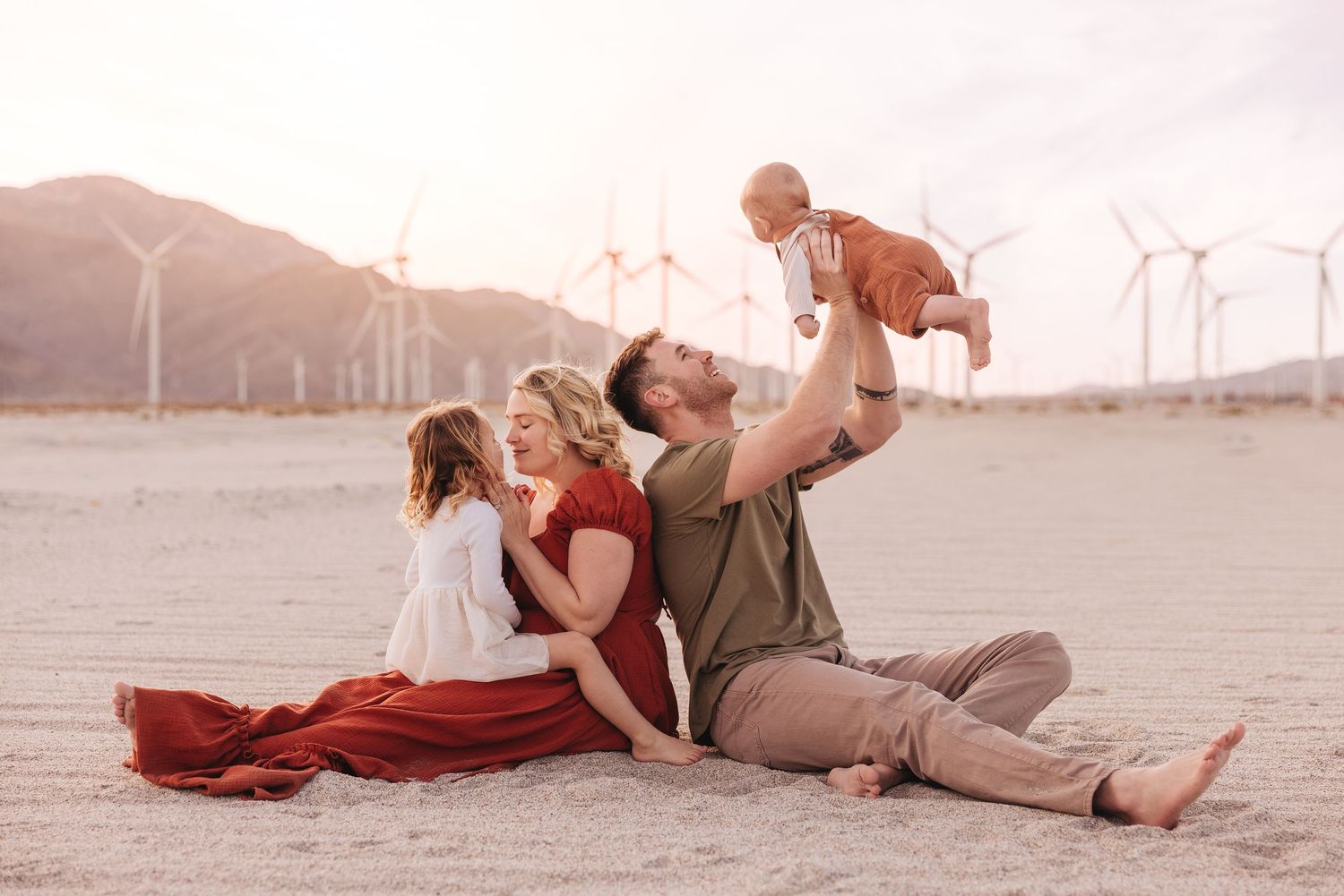
Bookmark this page for later when planning your session outfits
The biggest thing to remember: coordinated always photographs better than matching.
Think soft colors, natural textures, comfortable clothing, and outfits that allow movement. My goal is for your family to look connected, relaxed, and like yourselves.
DO
AVOID
Beach Session Colors
For Santa Barbara beach sessions, I love a soft pastel inspired palette:
cream
warm white
sand / warm beige
sage green
soft blue
dusty rose
muted pink
lavender
coral
muted teal
light denim
Bare feet, natural fabrics, and clothing that moves in the wind always photograph beautifully at the beach.
Foothills & Bluffs Session Colors
For foothills, bluffs, or garden sessions, I love warm earthy tones:
cream
mustard
rust
terracotta
sage green
dusty rose
lavender
muted teal
light denim
taupe
Think warm, rich colors without going overly dark.
In-Home Newborn Session Colors
Lighter colors usually photograph best indoors because they help keep the images soft, bright, and airy.
Beautiful options include:
cream
warm white
oatmeal
soft sage
pale blue
dusty rose
light neutrals
A Few Helpful Tips
• Flowy dresses and movement photograph beautifully
• If your daughter is wearing a dress, please add bike shorts underneath
• Avoid Peter Pan collars since they often flip up over little smiles
• If your child’s hair falls into their face easily, consider pinning a small piece back
• Smudge proof lipstick is always a good idea because there will likely be cuddling and kissing
For Maternity Sessions
For maternity photos, I recommend choosing something that shows your shape while still allowing movement. Soft fitted fabrics or flowy dresses tend to photograph beautifully and help create that relaxed, natural feeling.
I also have a client closet with a few maternity gowns available to borrow for your session, so feel free to ask if you’d like to see options before purchasing something new.
Why These Outfits Work
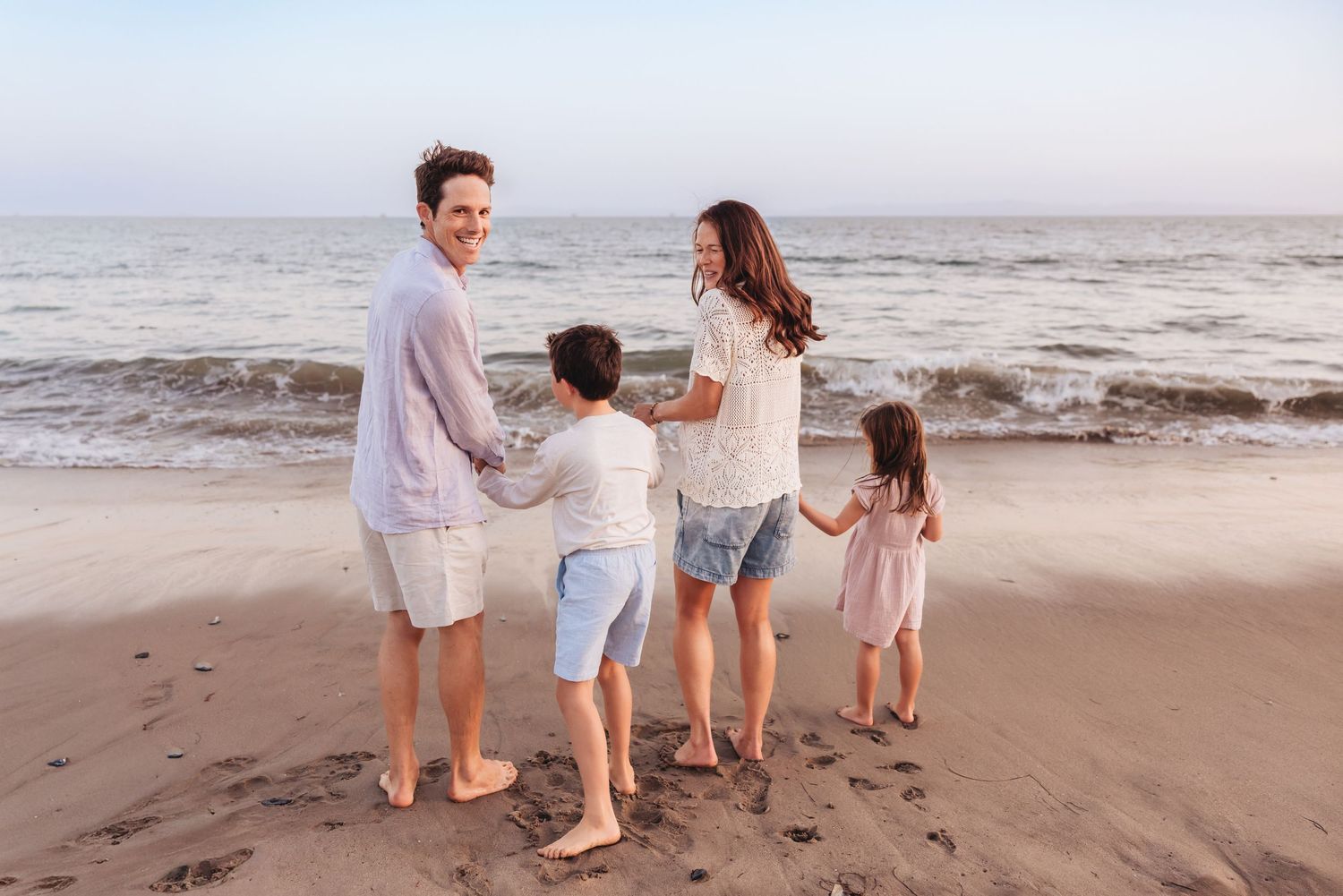
Why This Styling Works for a Beach Session
Soft pastels, light neutrals, and natural fabrics photograph beautifully at the beach because they reflect the soft tones of the sand, sky, and ocean. Bare feet, flowy dresses, and movement help the images feel relaxed and connected to the environment instead of overly formal.
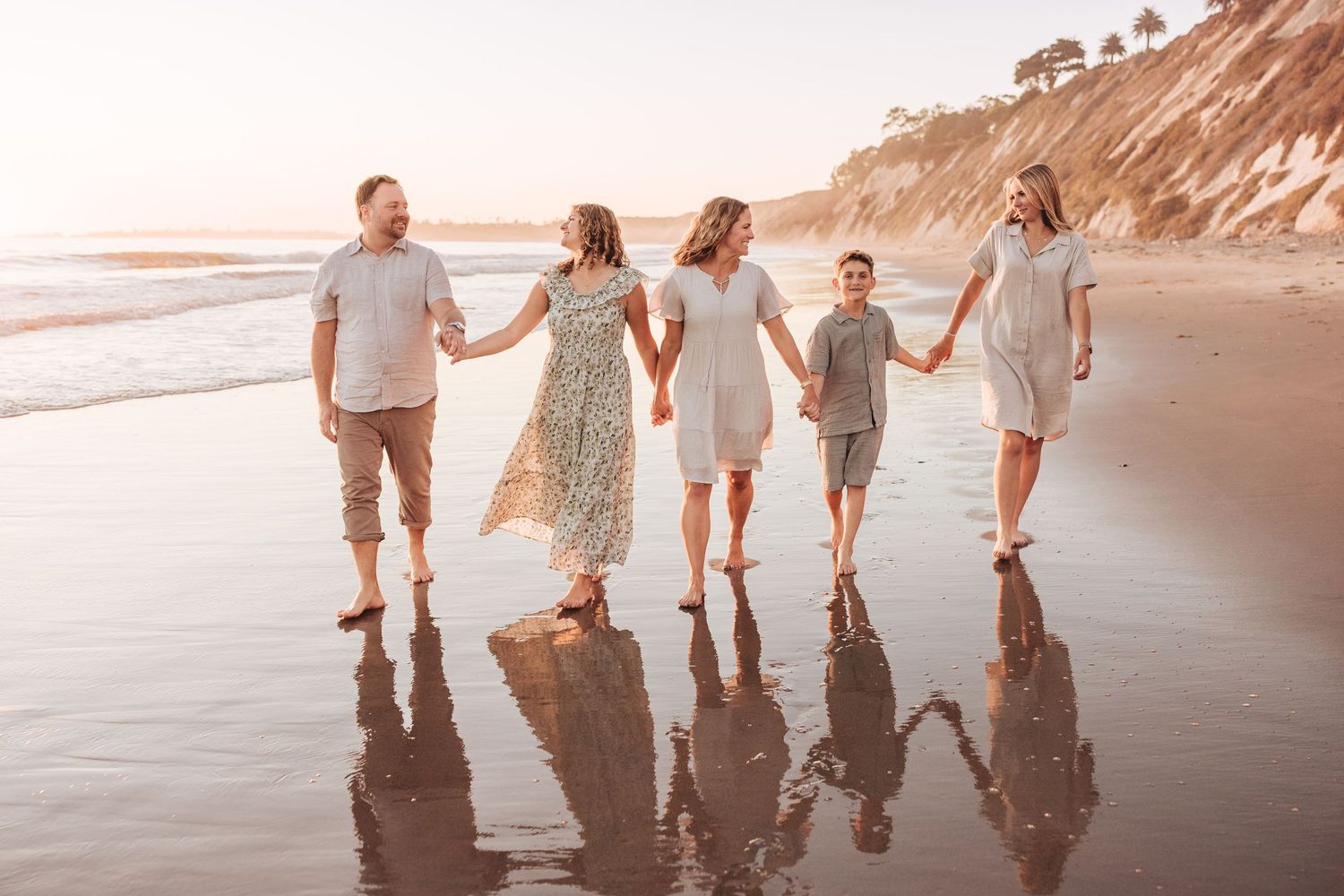
Why This Styling Works
Light colors, gauzy textures, sage greens, soft taupes, and sandy neutrals photograph beautifully at the beach because they reflect the natural tones of the environment. The soft palette keeps the images feeling airy, relaxed, and timeless, while the movement in the fabrics adds depth and softness to the photographs.
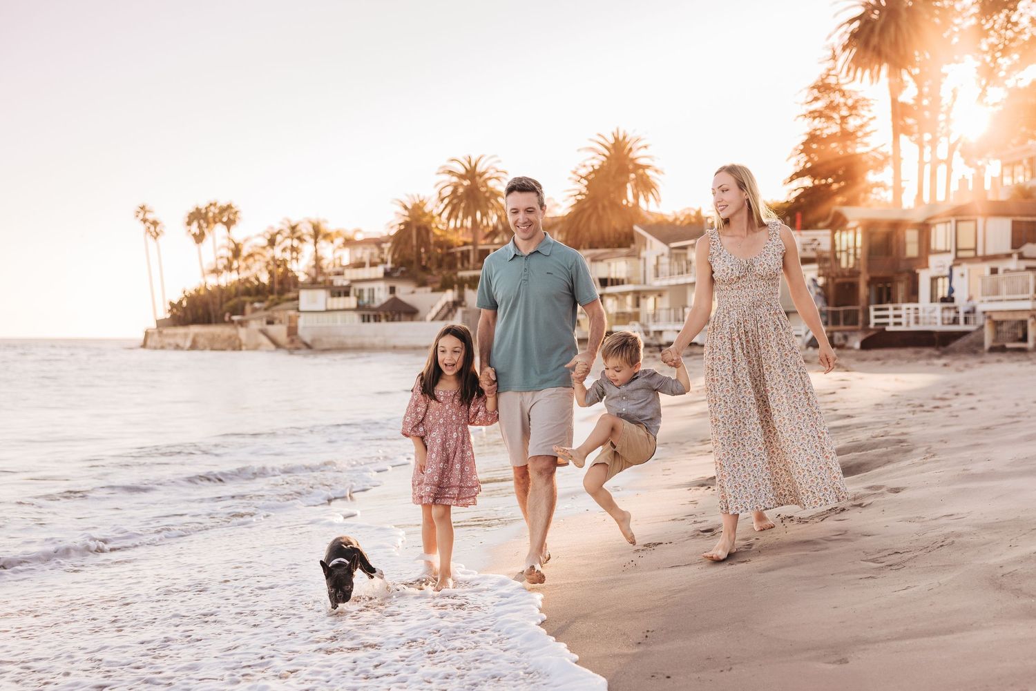
Why This Styling Also Works for a Beach Session
Can you tell beach sessions are my favorite?
Mom’s neutral patterned dress with soft pops of green and pink ties in beautifully with Dad’s sage green shirt and neutral shorts. Their daughter’s soft pink dress adds movement and softness, while their little boy’s light denim button up and neutral shorts keep everything feeling relaxed and timeless.
The entire palette feels light, coastal, and connected to the natural tones of the beach without looking overly matched.
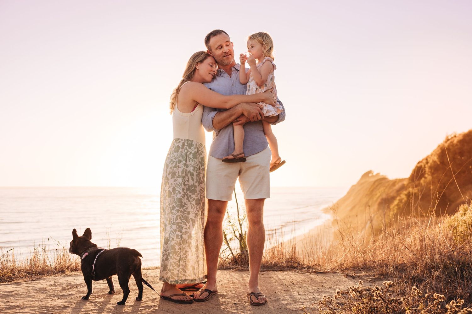
Why This Styling Works for a Bluffs Session
The sage green floral dress paired with cream neutrals, pastel blue on dad and the soft pink patterned dress on their daughter works beautifully at the bluffs. As the sun sets, these softer tones complement the golden light and surrounding landscape without competing with it. The mix of subtle patterns and muted colors keeps everything feeling natural, connected, and visually balanced.
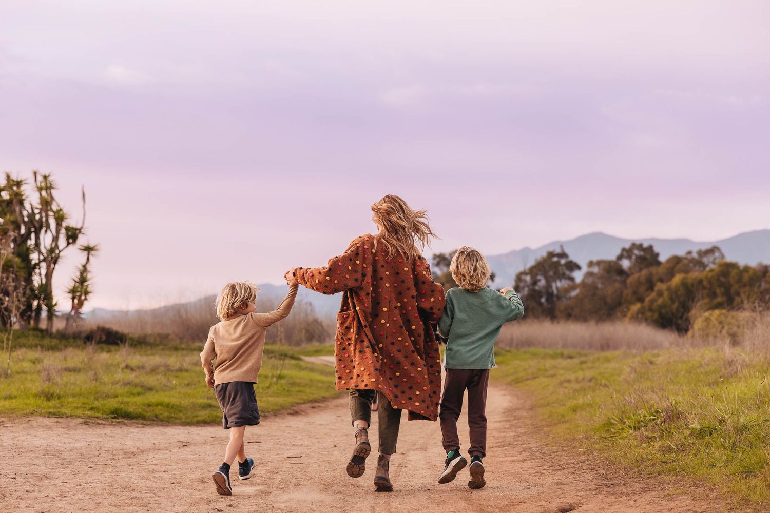
Why This Styling Also Works for a Bluffs Session
Warm earthy tones like terracotta, burnt orange, mustard, tan, and sage green complement the bluffs beautifully. Layers and texture add depth while still feeling natural, cohesive, and timeless.
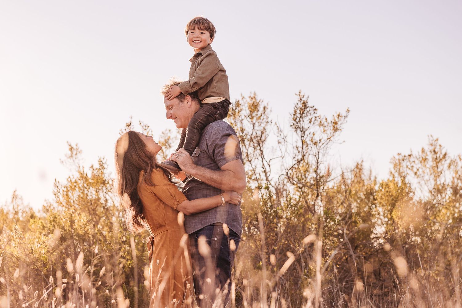
Why This Styling Works for a Golden Foothills Session
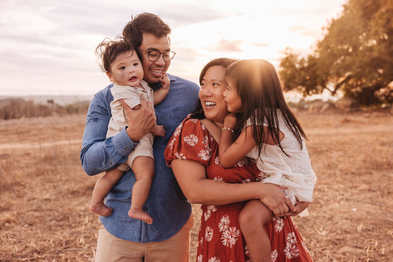
Mom’s burnt orange dress complements the golden grass beautifully, while Dad’s denim shirt and their little boy’s sage green shirt add soft earthy contrast. The neutral tones throughout keep everything feeling cohesive without looking overly matched.
The entire palette stays within medium earthy tones, which helps the family feel visually connected to one another and to the landscape around them.
Why This Styling Works
This styling works beautifully for a golden foothill session because the entire palette feels warm, earthy, and connected to the landscape. Mom’s rust red patterned dress adds richness and visual interest, while Dad’s denim shirt and neutral pants help ground the overall look.
The children’s neutral outfits keep everything feeling soft and balanced, and the subtle pattern on the little girl’s dress adds just enough detail without becoming distracting or overly bold.
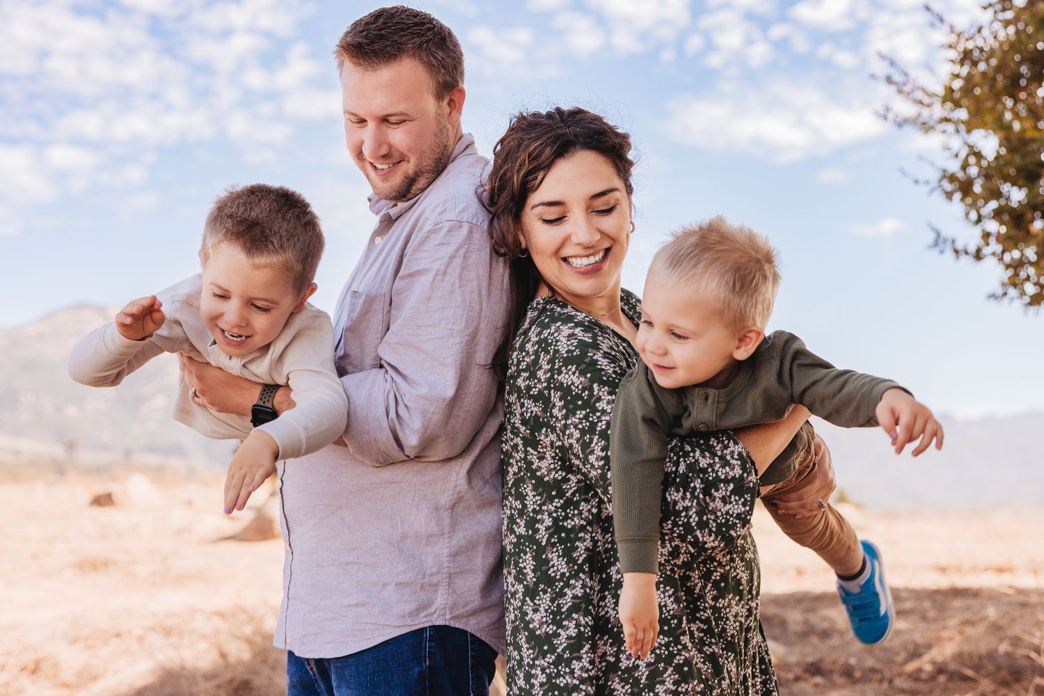
Why This Styling Also Works for a Foothills Session
Mom’s green patterned dress adds a beautiful focal point and just the right amount of visual interest, while the rest of the family staying in softer neutrals keeps everything feeling balanced and cohesive.
Dad’s light blue shirt works as a soft neutral, and the boys’ sage and cream tones complement the natural foothill landscape beautifully. Altogether, the palette feels earthy, relaxed, and timeless without looking overly coordinated.
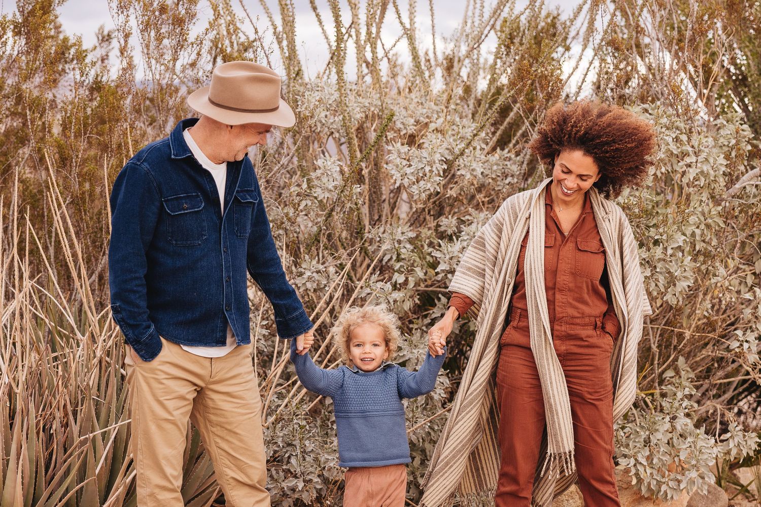
Why This Styling Works
Mom is wearing a beautiful soft pop of light orange, while the rest of the family stayed in neutrals and earthy tones. This creates a really balanced look where the eye is naturally drawn to her without feeling overly styled or distracting. The warm tones also photograph beautifully with the surrounding landscape and help everything feel cohesive and connected to the environment.

Why This Styling Works for a Cloudy Fall Day
Cloudy light tends to soften colors, so richer muted tones photograph especially well. Layering textures like knits, linen, denim, and sweaters helps add warmth and dimension.
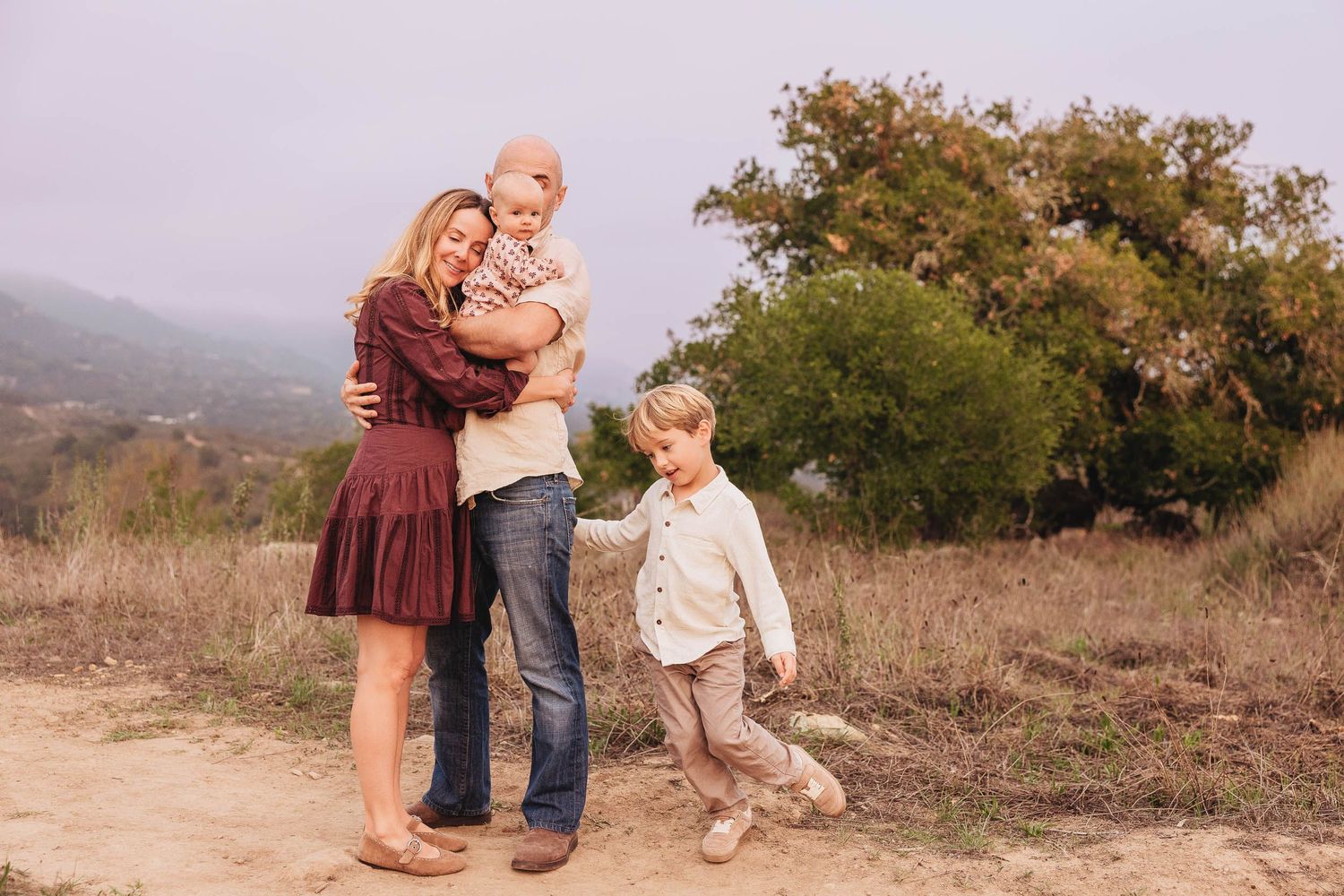
Why This Styling Also Works for a Cloudy Day
Mom’s light burgundy dress adds warmth and depth without feeling too dark, while the baby’s pink and maroon outfit ties everything together in a subtle way.
Dad’s neutral shirt and denim keep the palette grounded and relaxed, and their son’s light neutrals help balance the richer tones. Altogether, the colors feel cozy, connected, and perfect for a softer overcast session.
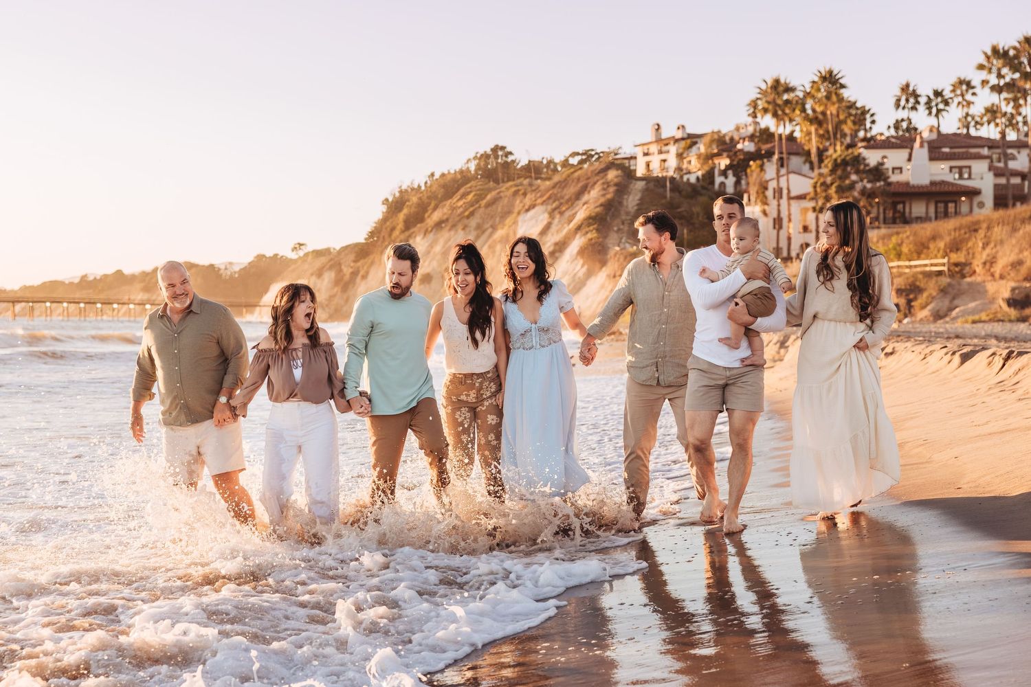
Why This Styling Works for an Extended Family Session
Large family sessions tend to photograph best when everyone stays within a coordinated color palette instead of matching exactly. Mixing complementary tones and neutrals keeps the overall image feeling cohesive while still allowing each family unit to have personality and variation.
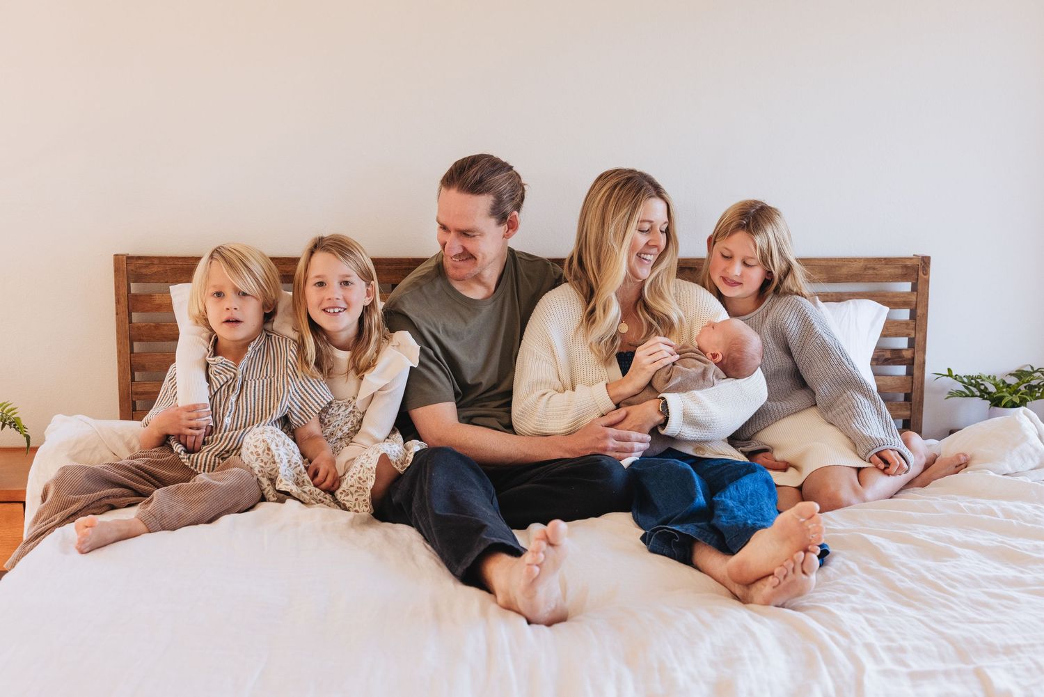
Why This Styling Works for an In-Home Newborn Session
Soft light colors help keep newborn sessions feeling bright, calm, and airy indoors. Comfortable fabrics and neutral tones keep the focus on connection, cuddling, and the emotion of those early days together.
Most Importantly